For my final HCI project, I worked in a team of 4 to redesign MyHousing, an online
platform students at Brandeis University use to select housing/dining.
Role: UX/UI Designer, UX Researcher
Date: October 24th - December 5th, 2019
Tools: Adobe XD
The Challenge
Every year, Brandeis students must apply to live on-campus using the online platform MyHousing.
Though they're able to apply for housing and dining in the end, there are always complaints about it being
confusing to use. Thus, my group and I chose to redesign it for our final HCI project.
MyHousing is not efficient to use. It could do much more to help students select the right housing
and dining for them. How could we redesign MyHousing so that it is more intuitive, efficient, and has
higher utility?
Current Design
This is what the MyHousing home page currently looks like:
My entire team and I were students who have used MyHousing at least once.
Therefore, we could draw from personal experience on how it could potentially be improved.
We all agreed that the menu was poorly designed: it's hard to read and there were too many options
for such little tasks. For example, "More Tasks" only contained the room condition report. We also all
felt that having access to floor plans in MyHousing would be helpful (currently, the floor plans are
placed on a page of Brandeis's official website). Most importantly, we felt the actual housing/dining
selection process was not the most straightforward. You have to click quite a few links, while receiving
no confirmation that you're headed in the right direction.
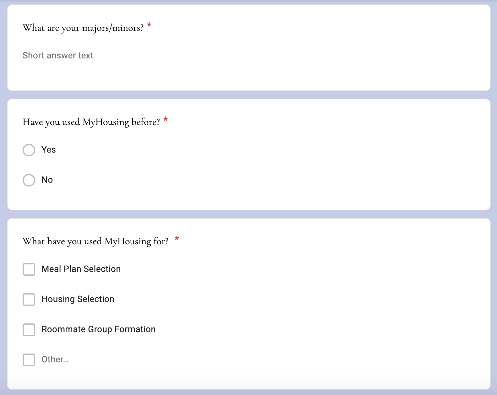
Research
Though we were confident in our beliefs, we still felt it was important to see exactly what other students
were thinking as well. As a result, we created a questionnaire that we sent to students we knew and posted
in social media groups. We received about thirty responses. We also conducted four interviews, where we were able to acquire
more in-depth answers.
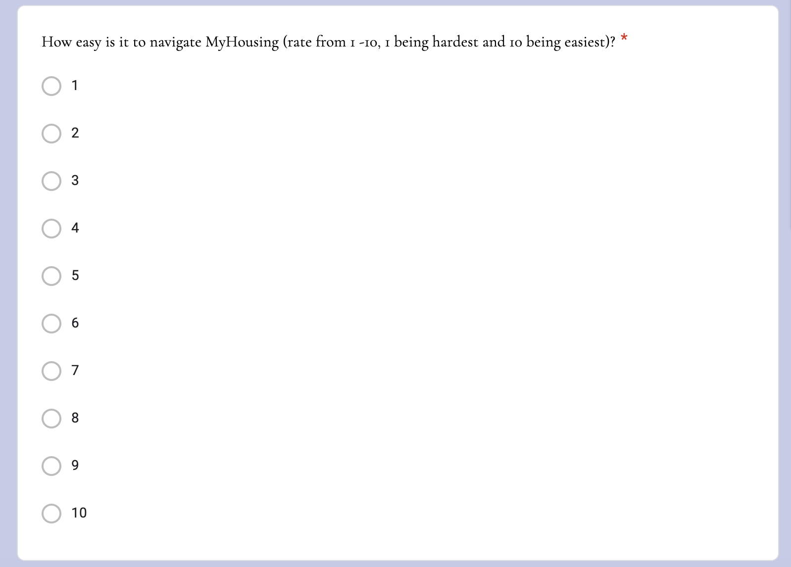
The questionnaire and interviews yielded interesting results:
1. From the questionnaire, 26%, the biggest percentile, ranked navigating MyHousing
to be a 6 on a scale of 1-10, with 1 being hardest and 10 being easiest. This contrasted from the interviewees
that claimed navigating MyHousing was more difficult (a 4 on average).
2. We were hoping to have our interviewees play around with MyHousing, but since most of it is locked outside of
selection times, we asked them to describe the selection process as best they could. No one could seem to remember how the housing/dining selection works. All they
knew was that every year, they have to click around with the platform for a little bit and figure out how to
select housing/dining.
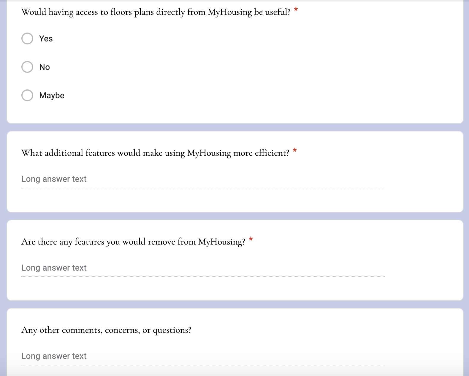
3. All of the participants agreed that the direct access to floor plans from
MyHousing would be useful.
4. Many participants mentioned that MyHousing does not do much to help find roommates.
They all had to rely on being able to request friends as roommates.
5. In terms of removing features, they found the messaging platform unhelpful.
No one knew how to use it.
Overall, we concluded that MyHousing is not that ineffective, but it does not meet its potential in helping students achieve their housing/meal plan goals.
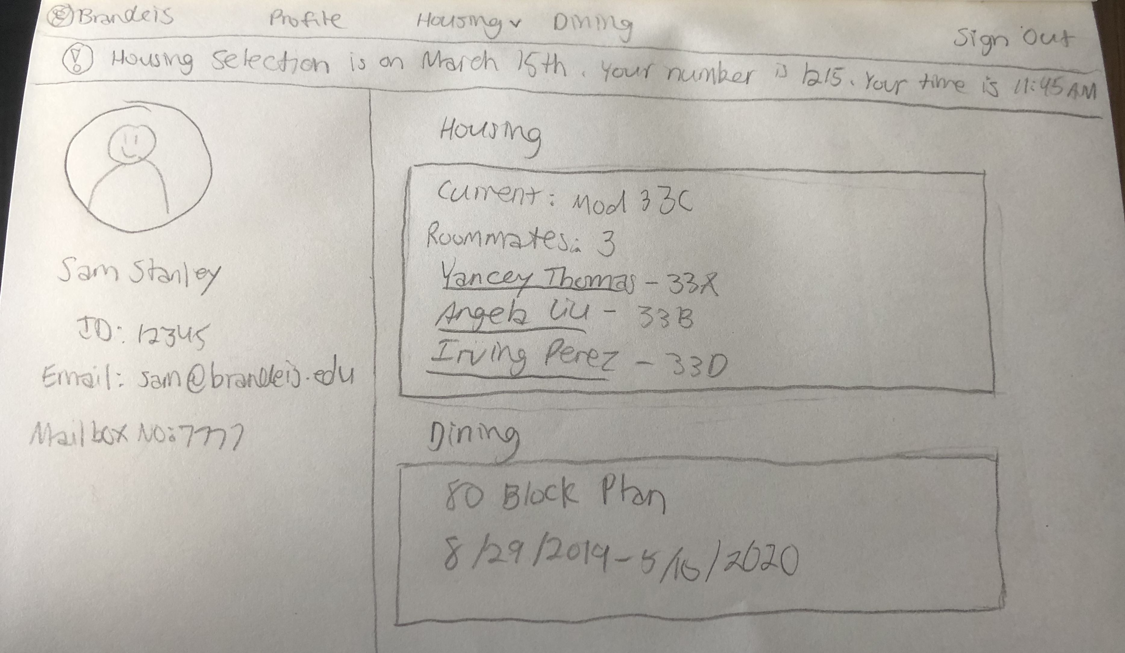
Paper Prototype
Based on our responses, we thought of a design that was more straightforward and had higher
utility by adding floor plans and a roommate matching system. We created a paper prototype to test our ideas. We had
ten subjects, all of whom were also students. Our tests utilized this scenario:
Sam Stanley is a sophomore at Brandeis University getting ready to select
housing for next year. Sam wants to live in the Hassenfeld building of East Quad due to its close
proximity to his classes. He would prefer his room to be on the first or second floor so he
does not have to climb many stairs. Sam did not have a positive experience with his suitemates this year, so
he is also searching for a new roommate. His other friends already have housing plans, so he is hoping
that MyHousing could match him with someone compatible.
Our subjects were able to navigate our prototype quickly and easily. They all agreed
that our redesign was more efficient and useful. We did, however, receive a couple of suggestions. A major one
was to indicate which dorms still had available rooms, as some are way more popular than others, to save the user time.
One subject also felt that our prototype was not always clear on which text was a link and which wasn't. Additionally, they
thought at first that the rooms shown on the East: Hassenfeld page were the only ones available. We had intended
for the page to be scrolled down to view all options. After collecting the feedback, we updated our design and
created our wireframes.
High Fidelity Wireframes
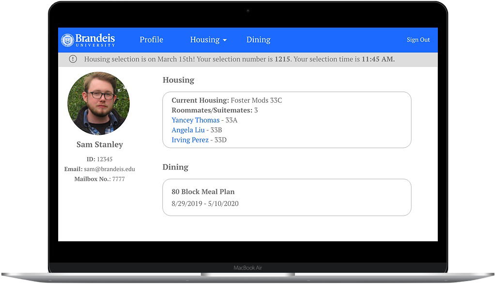
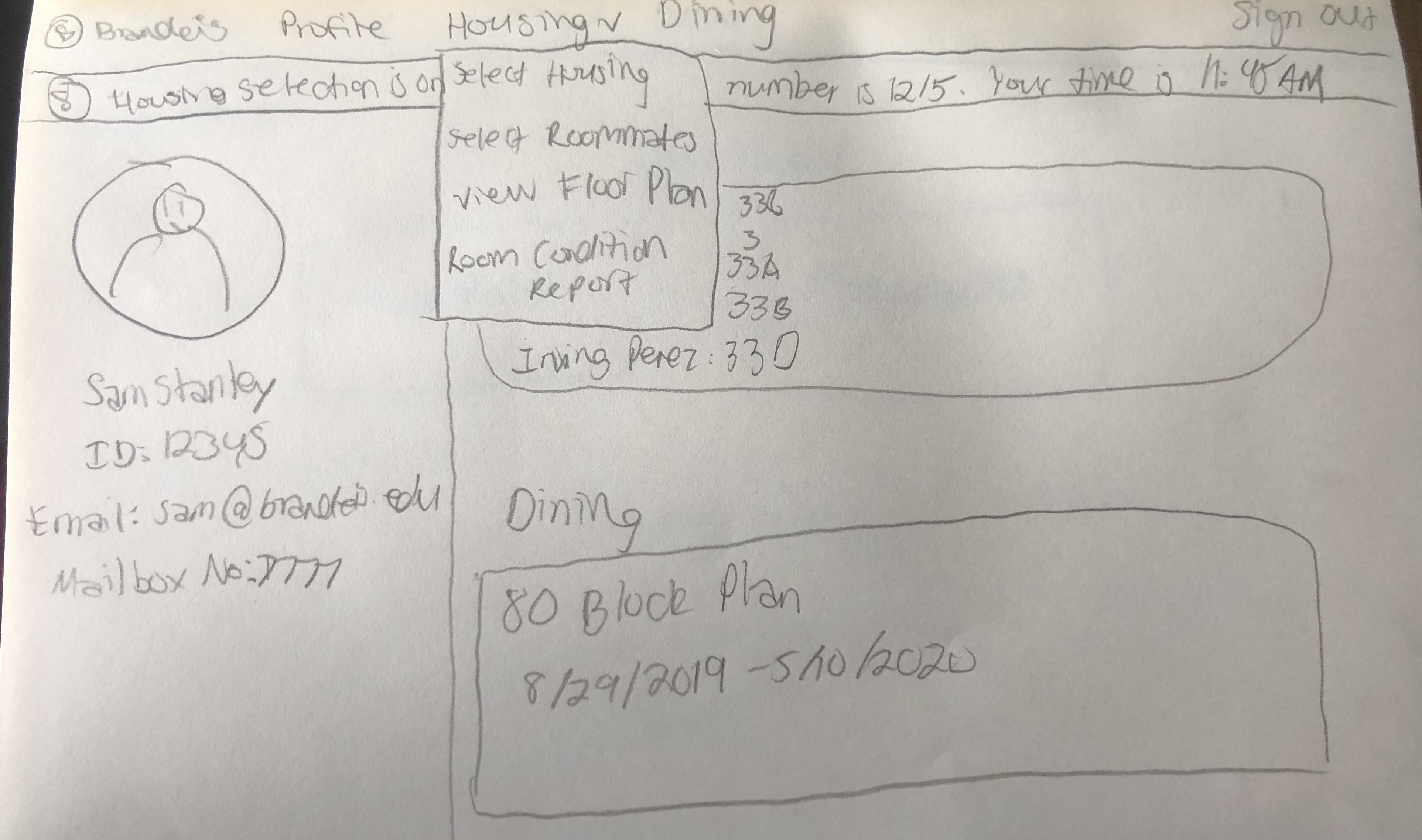
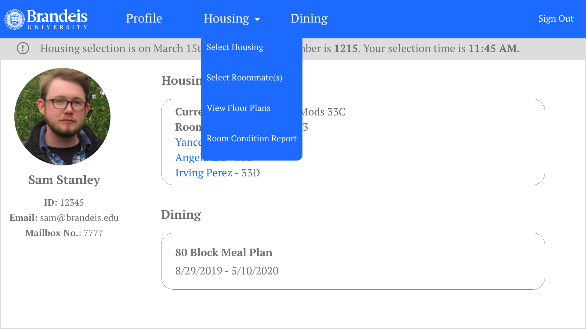
The new home page. Changing the menu text from gray to white
makes it much easier to read. The menu is also much more simple, featuring the
only options that really matter (with Housing having a drop-down of important tasks). We removed the "Home"
button and made the Brandeis logo act as that. We also designed it that during the housing selection period,
a banner indicating the user's selection time/number appears at the top as a reminder.
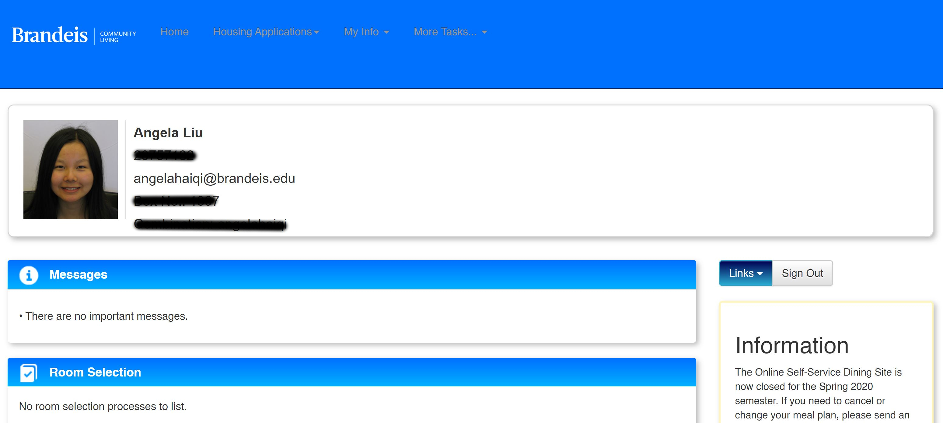
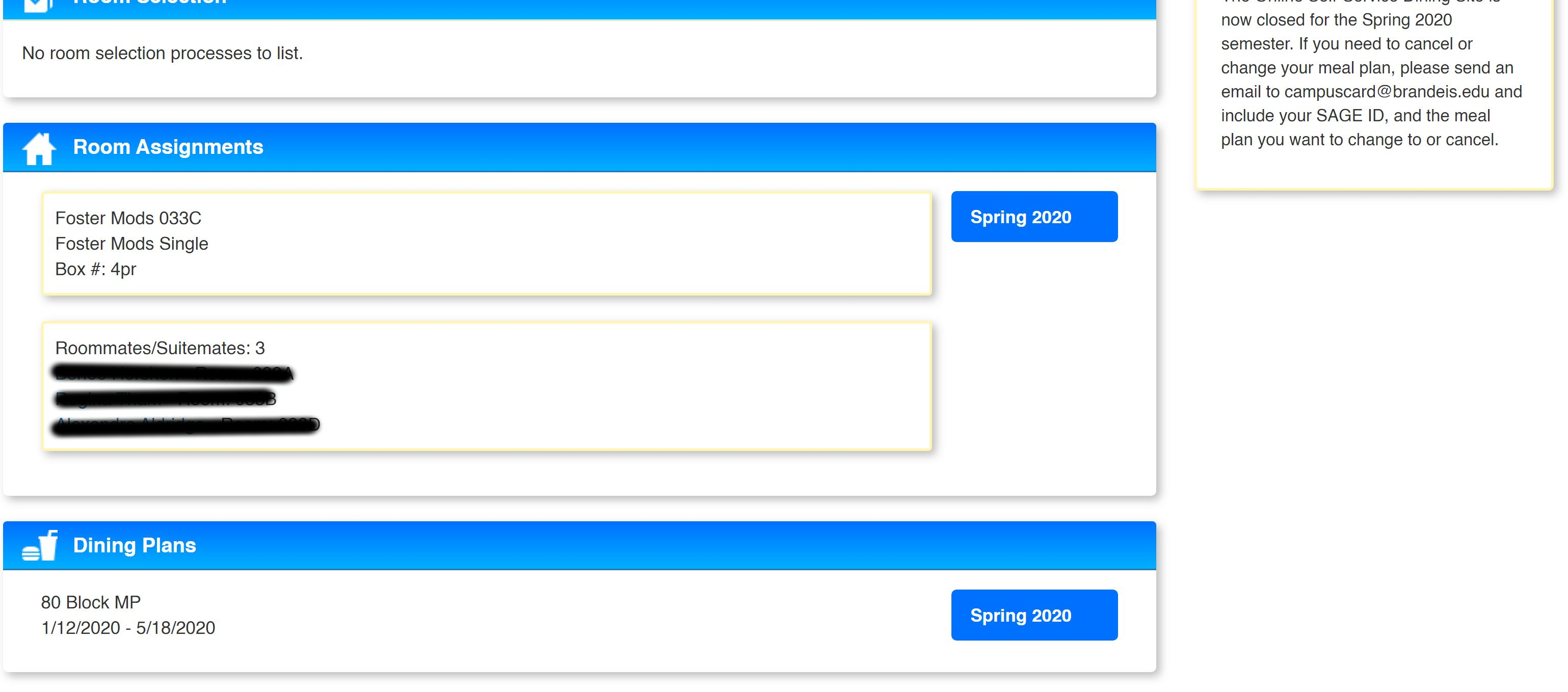
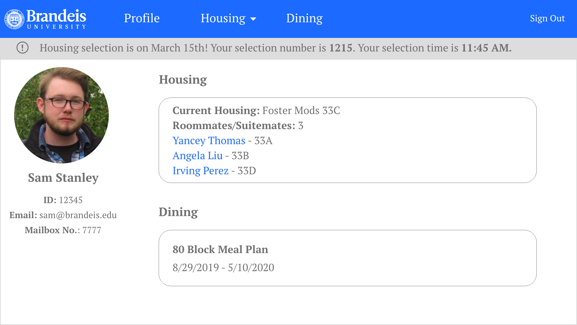
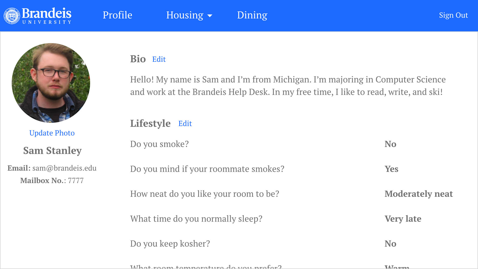
The profile page. In the current design, the list of
roommates/suitemates on the home page link to their mail. In our new design, since users have
legitimate profiles, the names are linked to their profile. Here is Sam's profile. Profile photos
default to student ID photos, but users have to option of replacing it with a nicer photo. They can
also write a short bio and answer a lot of lifestyle questions. The answers to the questions are
crucial for roommate matching. If a user is viewing someone else's profile, the email will be linked.
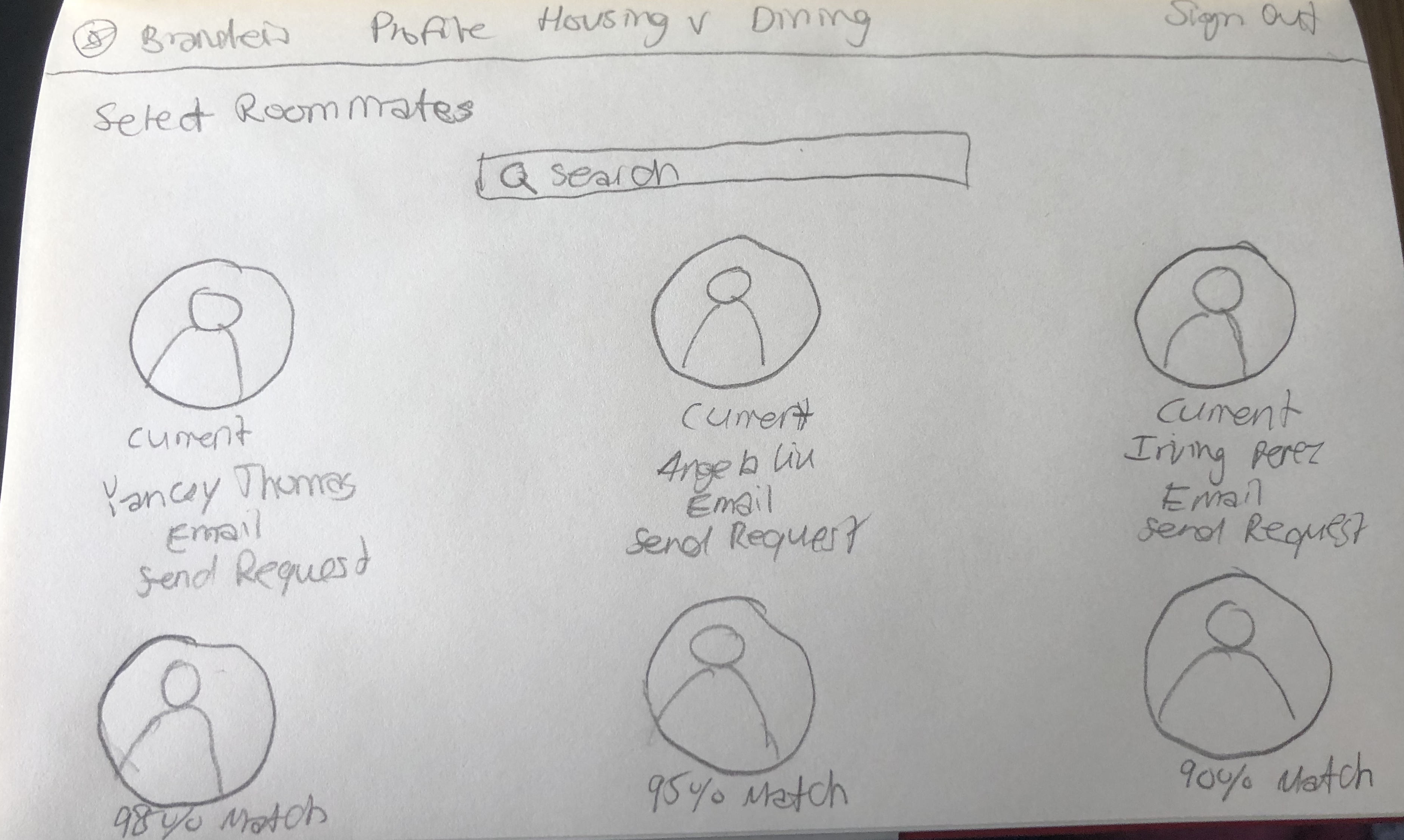
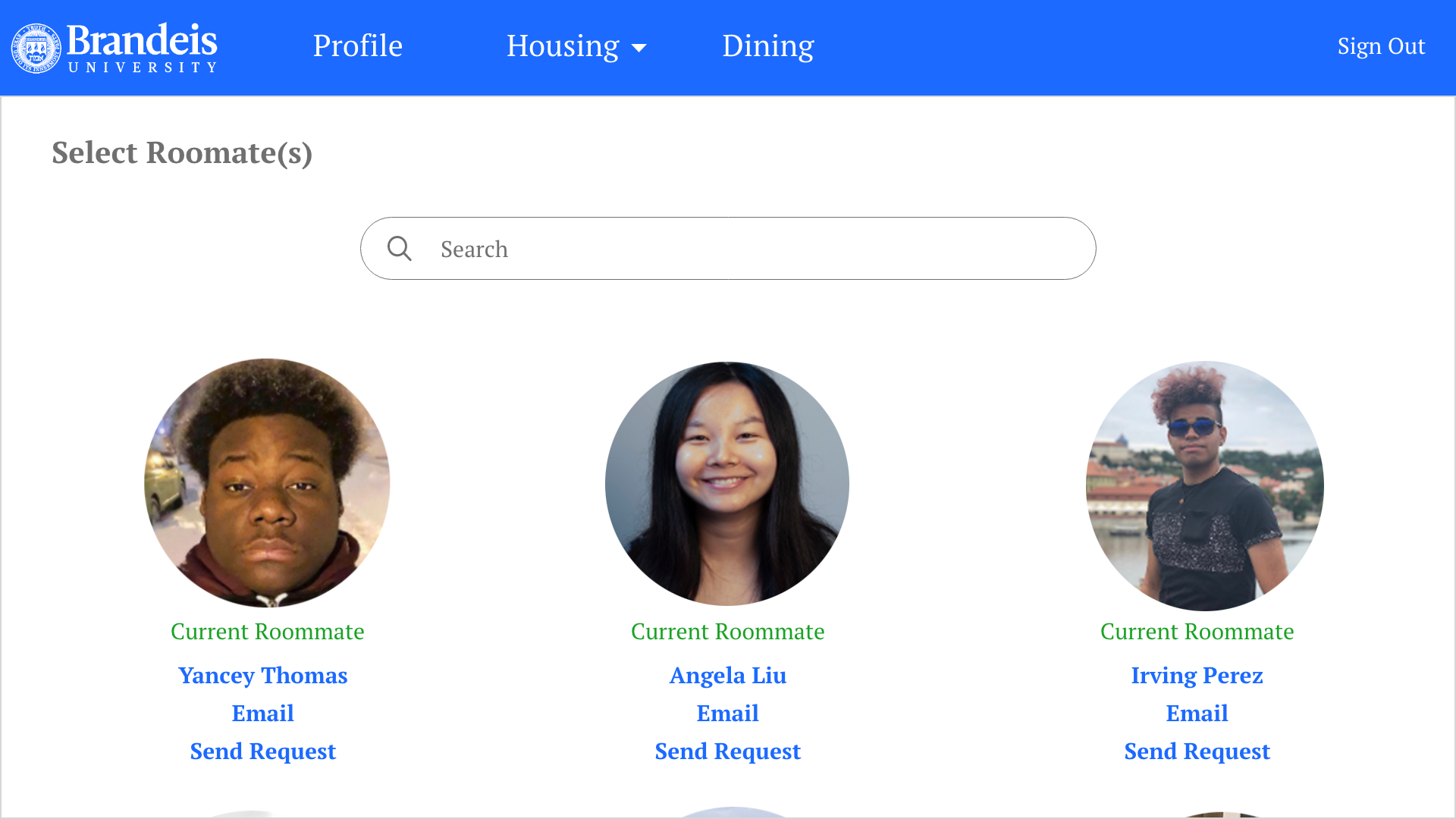
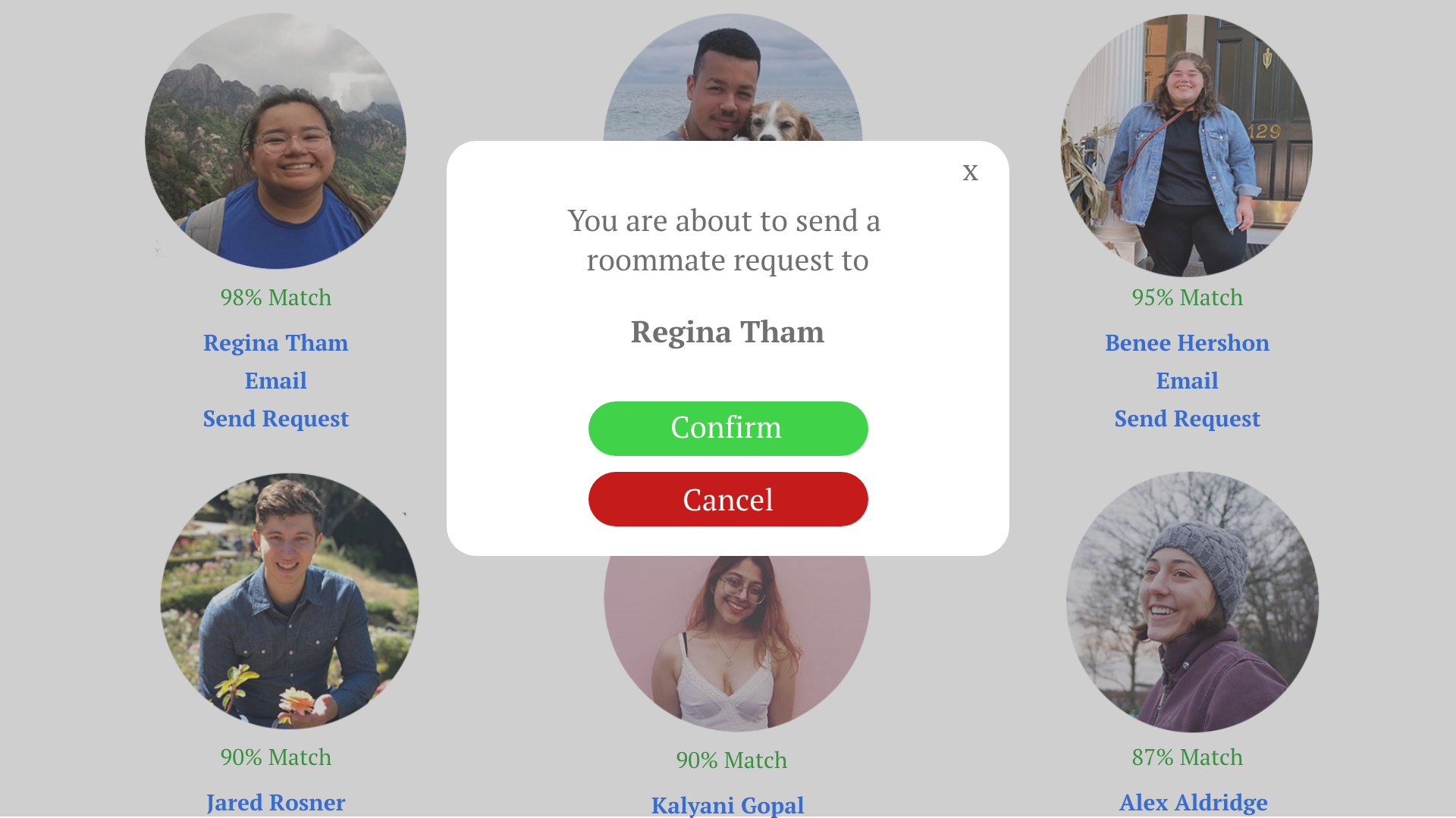
Selecting a roommate. Based off answers to the questions on Sam's profile,
the platform will show the students in his year who he matches best with (it will go down to 80%). His current
roommates will always be pushed to the top, in case he wants to live with them again. He also has the option of
searching for anyone in the school. He can view people's profiles, send emails, and send roommate requests
(the other student will be notified through email if they receive a request and can accept through there).
Once they have accepted his request, Sam can pull them into any dorm he chooses.
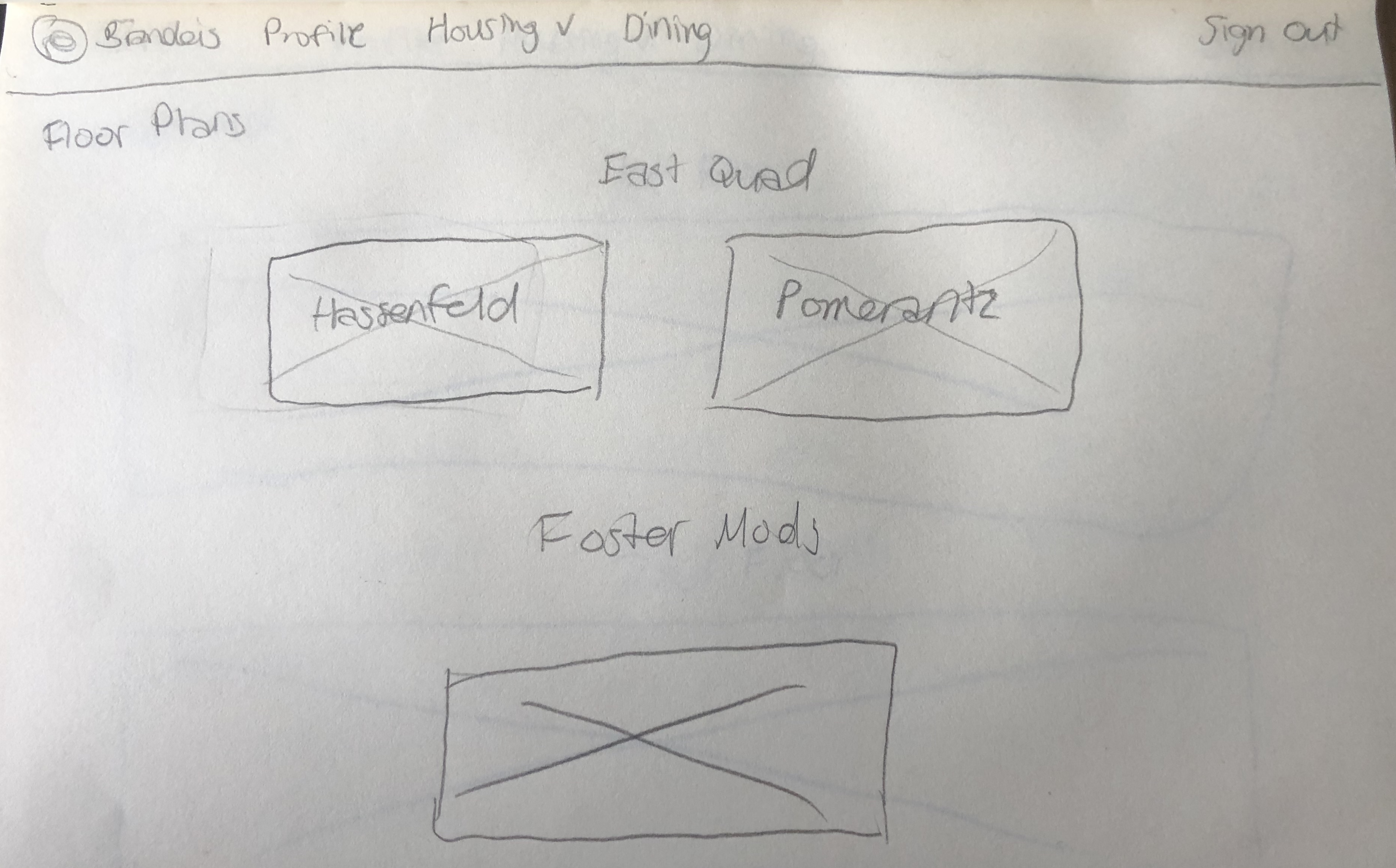
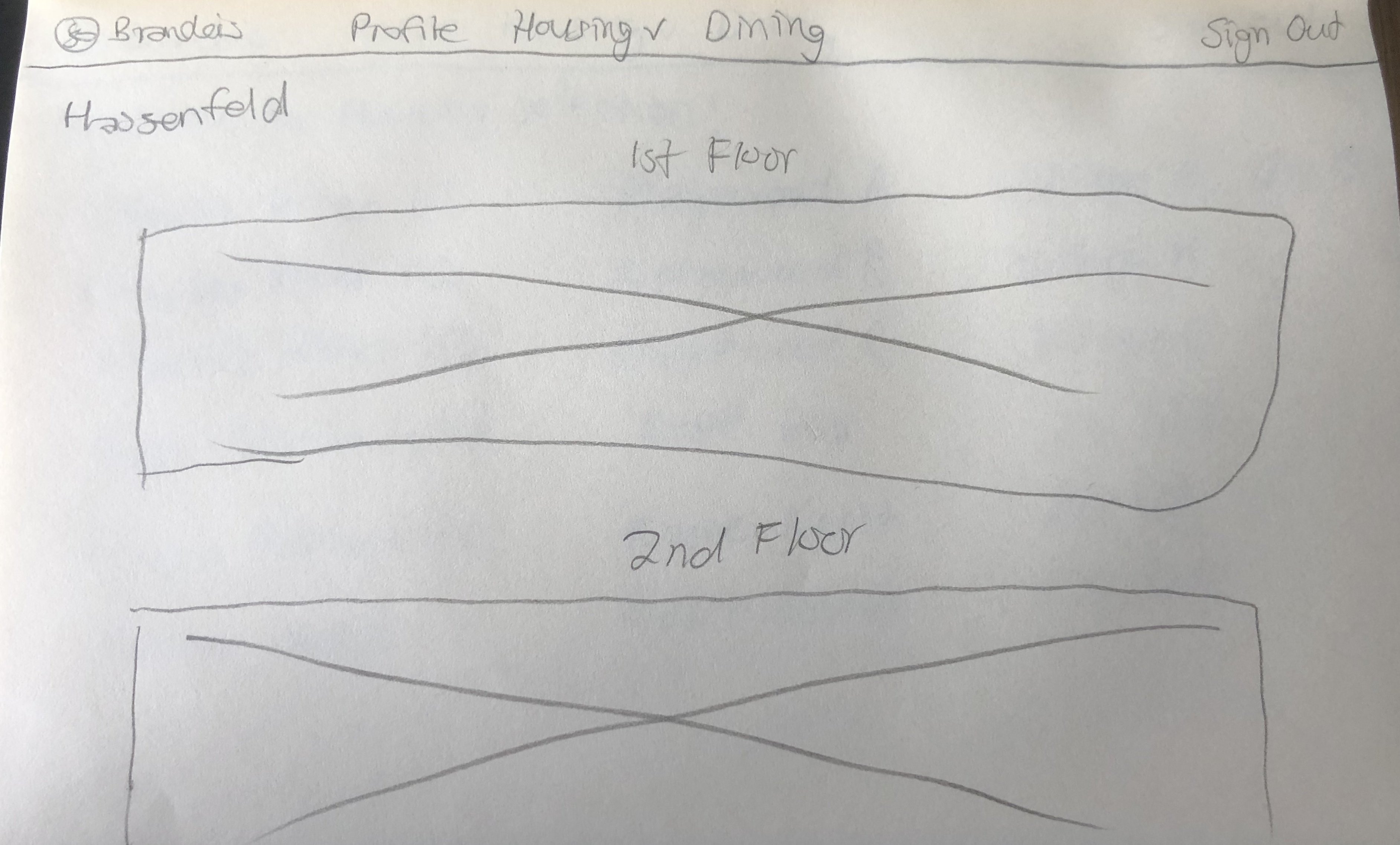
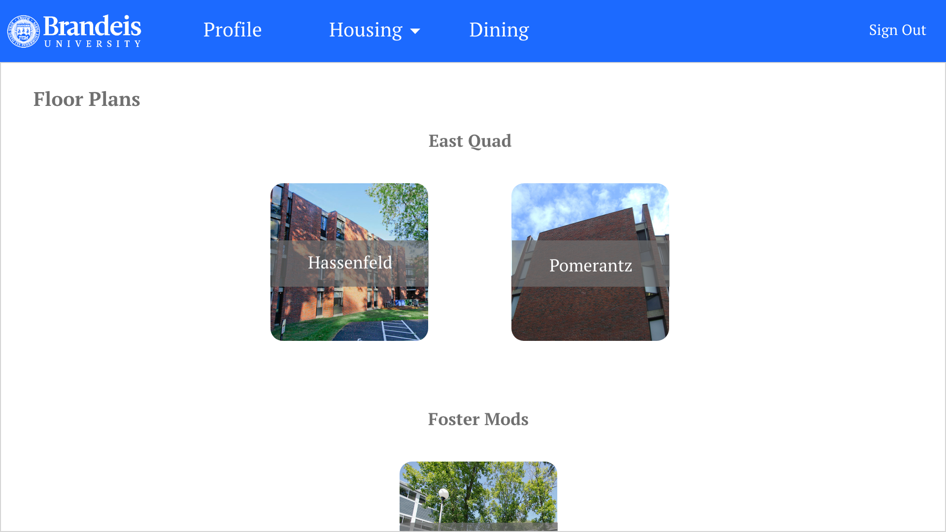
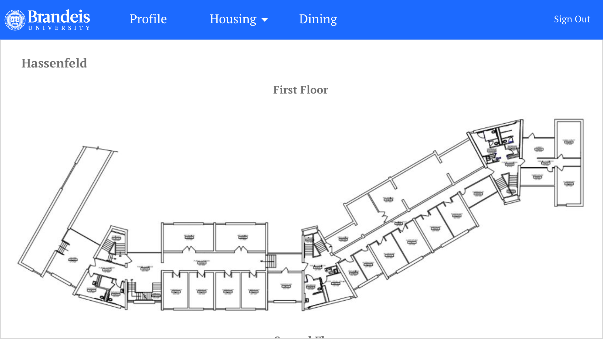
Viewing floor plans. If Sam wants to view the floor plans of
Hassenfeld, all he has to do is click "View Floor Plans" and click "Hassenfeld." From there, he can see the
plans of each floor. He can click on them and interact with them, zooming in and dragging it to get a better look.
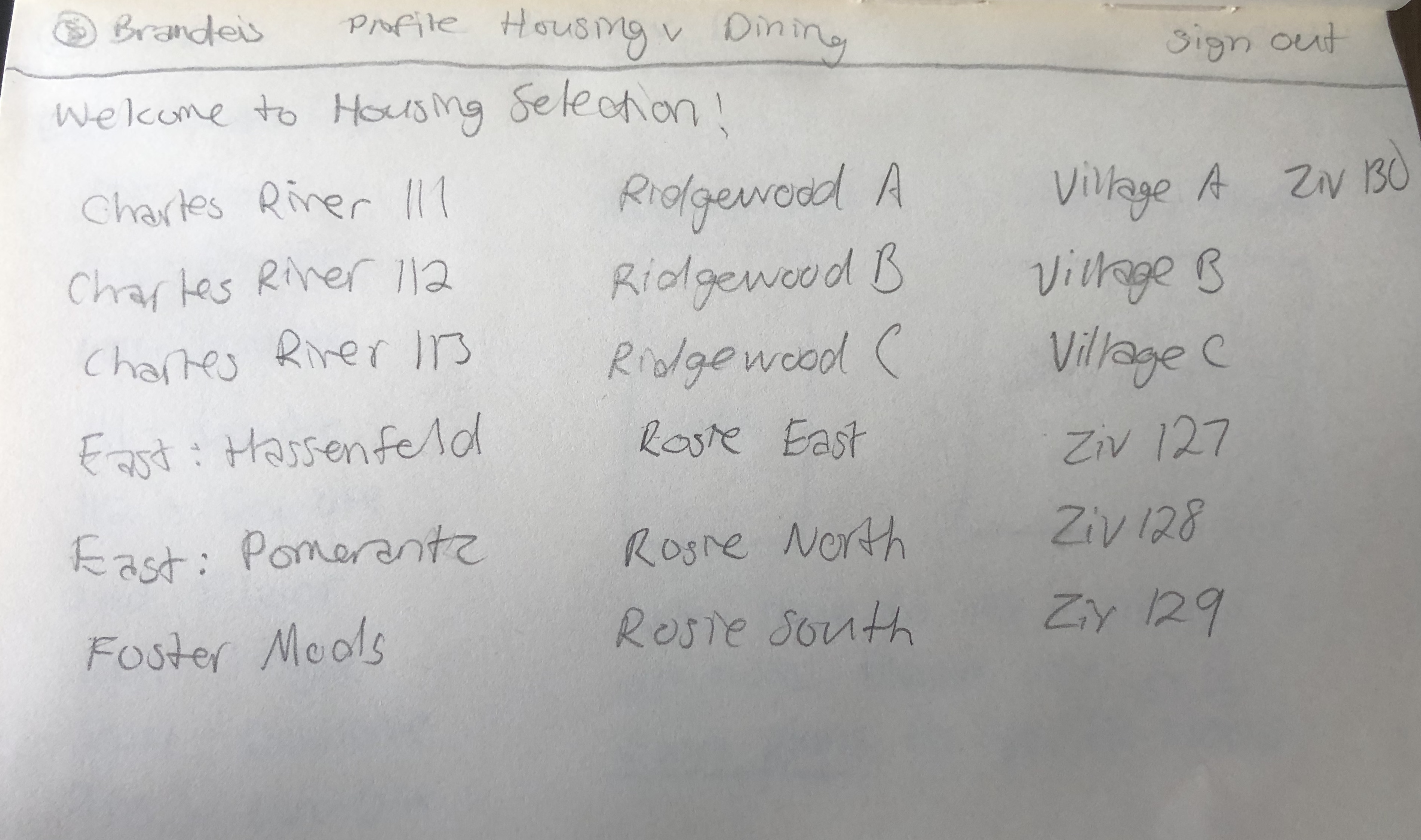
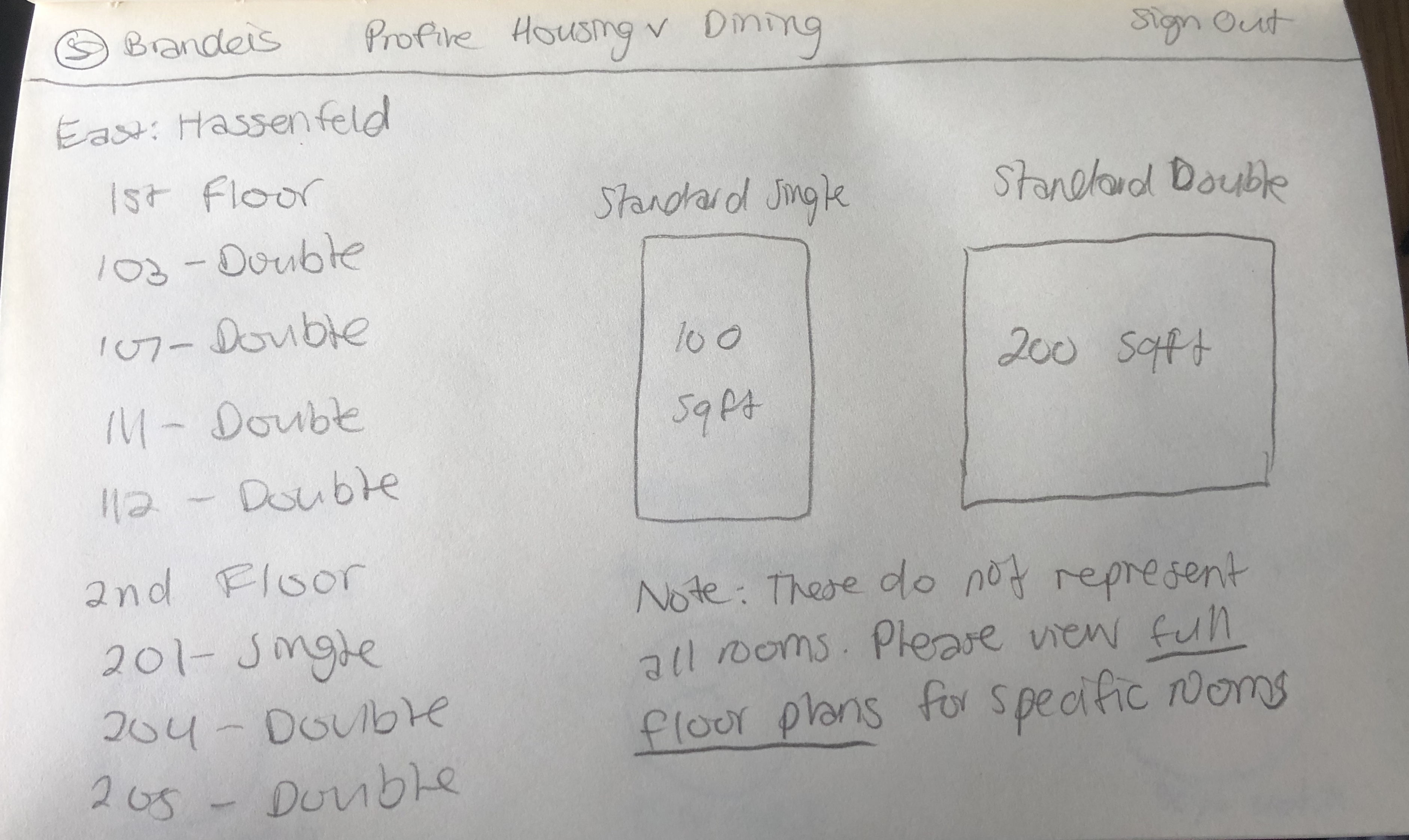
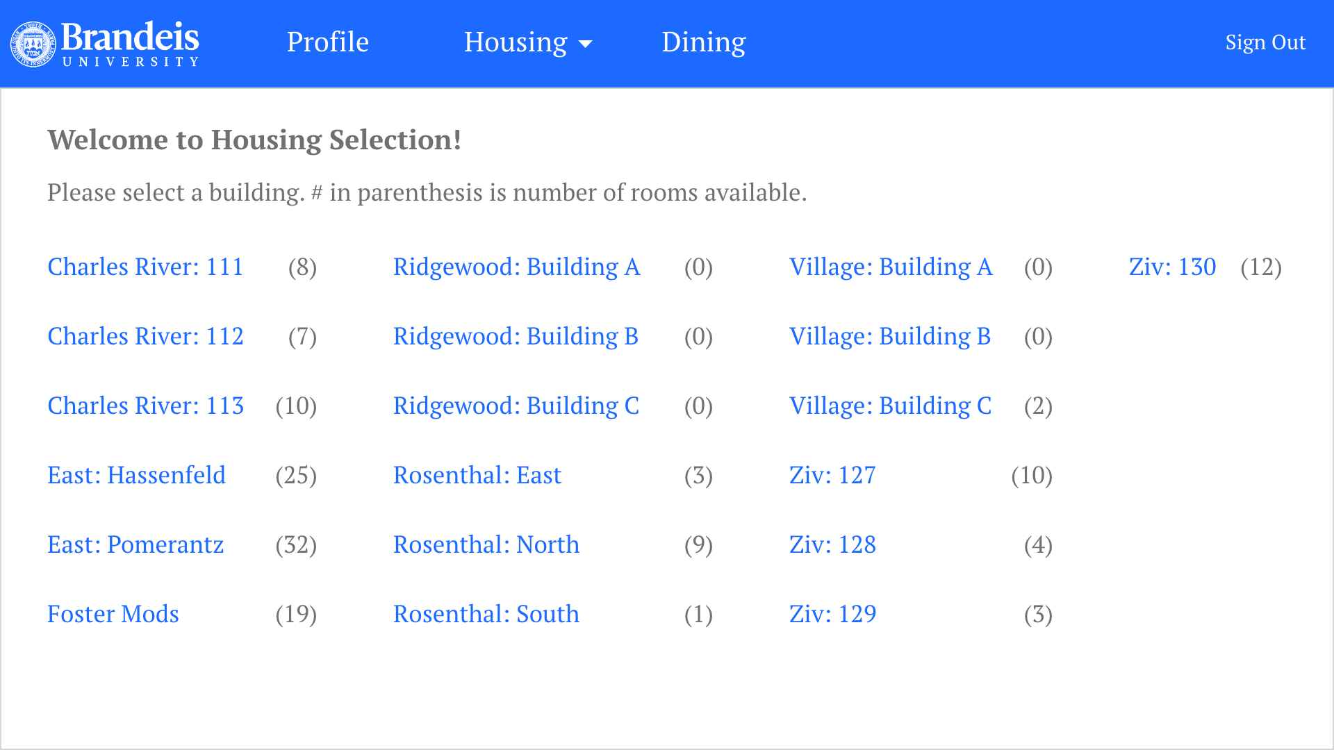
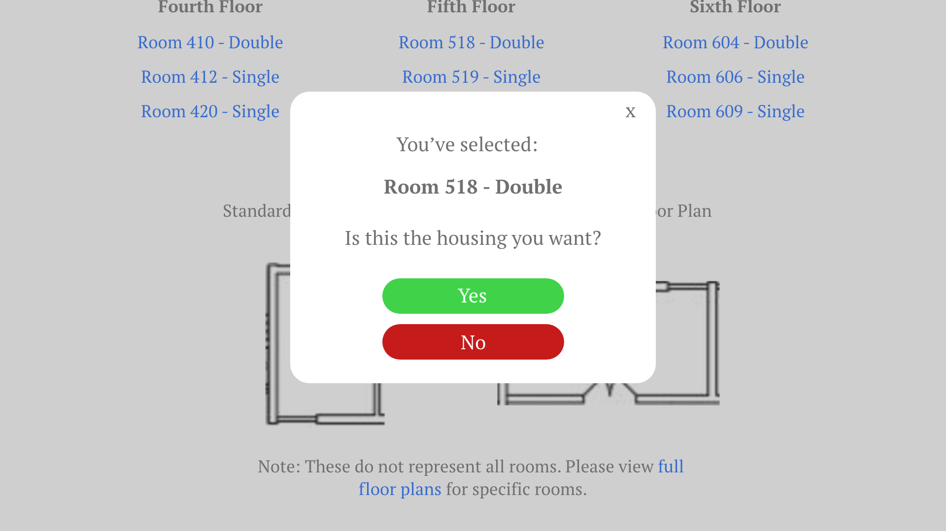
If it is now Sam's time to register, all
he has to do is click "Select Housing" from the drop-down. All the dorms at Brandeis are listed. We
took the suggestion of indicating the number of available housing. This saves the user time from clicking in to see
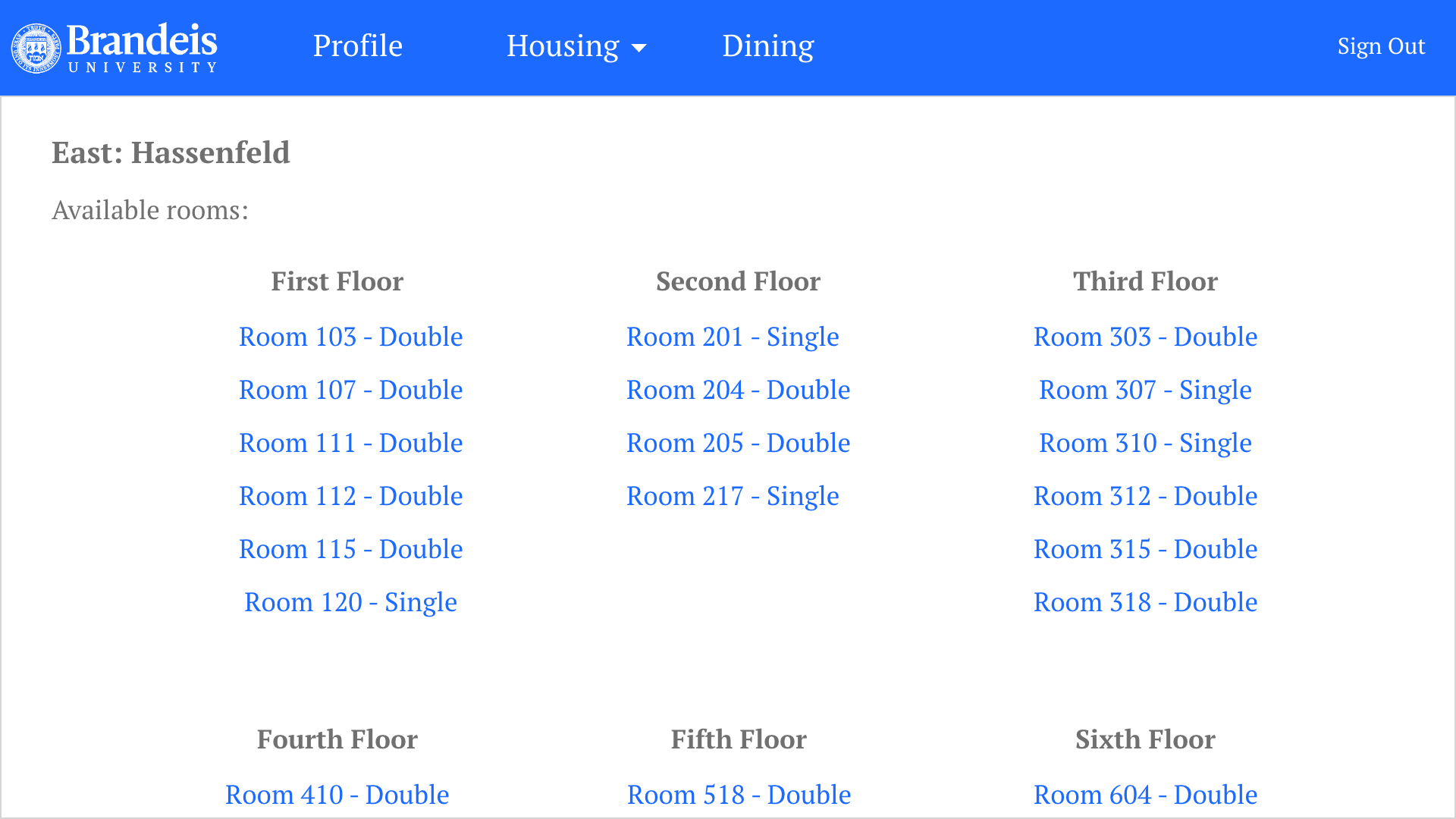
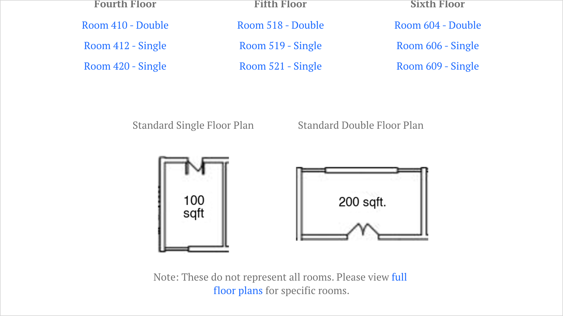
which rooms are available in each building. We also rearranged how each room was listed, making all the
options clearer. In each dorm, Sam can see the floor plan of a standard room as an added reference, though he will need to see the
actual floor plans for specific rooms.
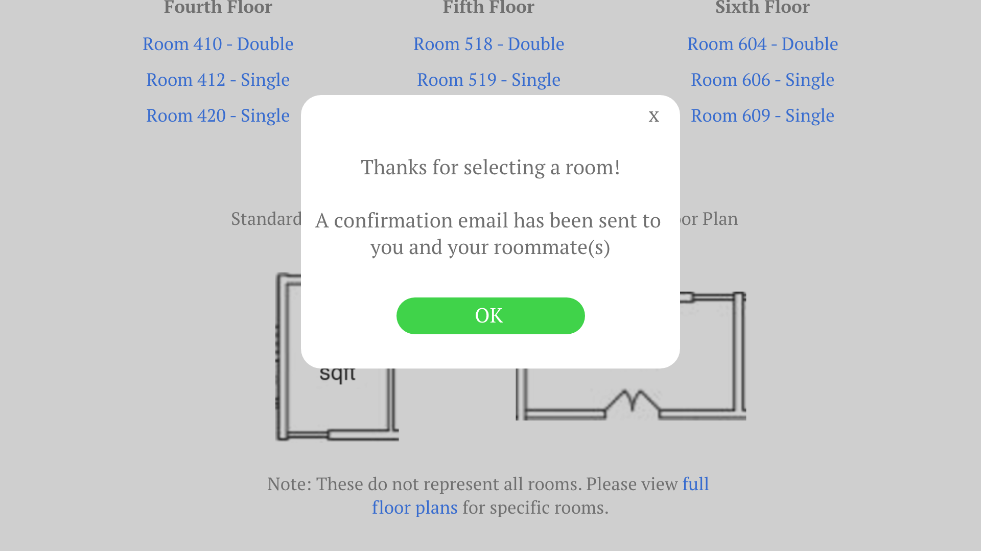
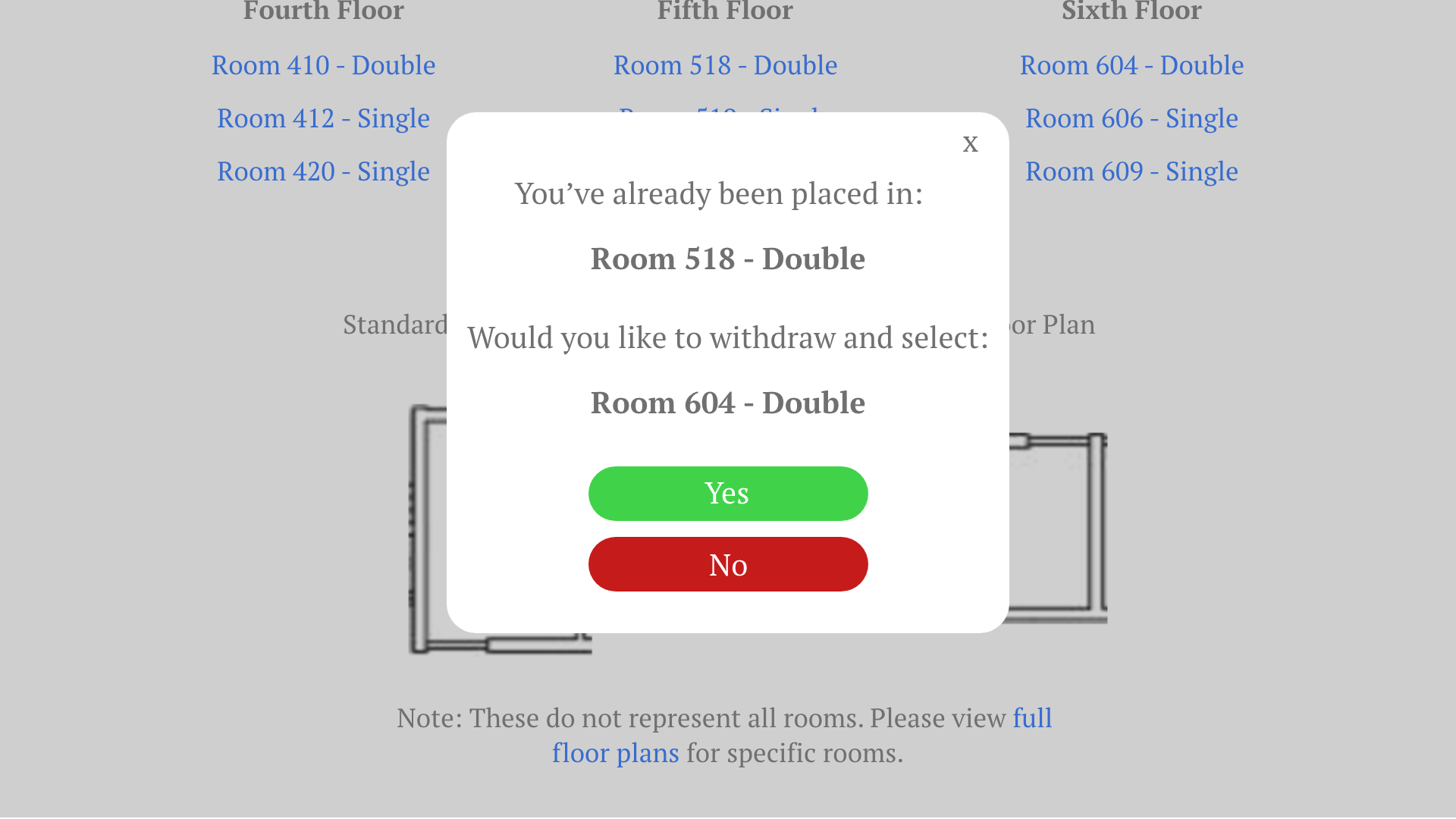
Once he has decided on a room, he can click on it and confirm his
selection. He also has the option to change his selection by clicking on another room and confirming for that.
Once he confirms, an email will be sent to him and his roommate(s) so they know the selection has been processed.
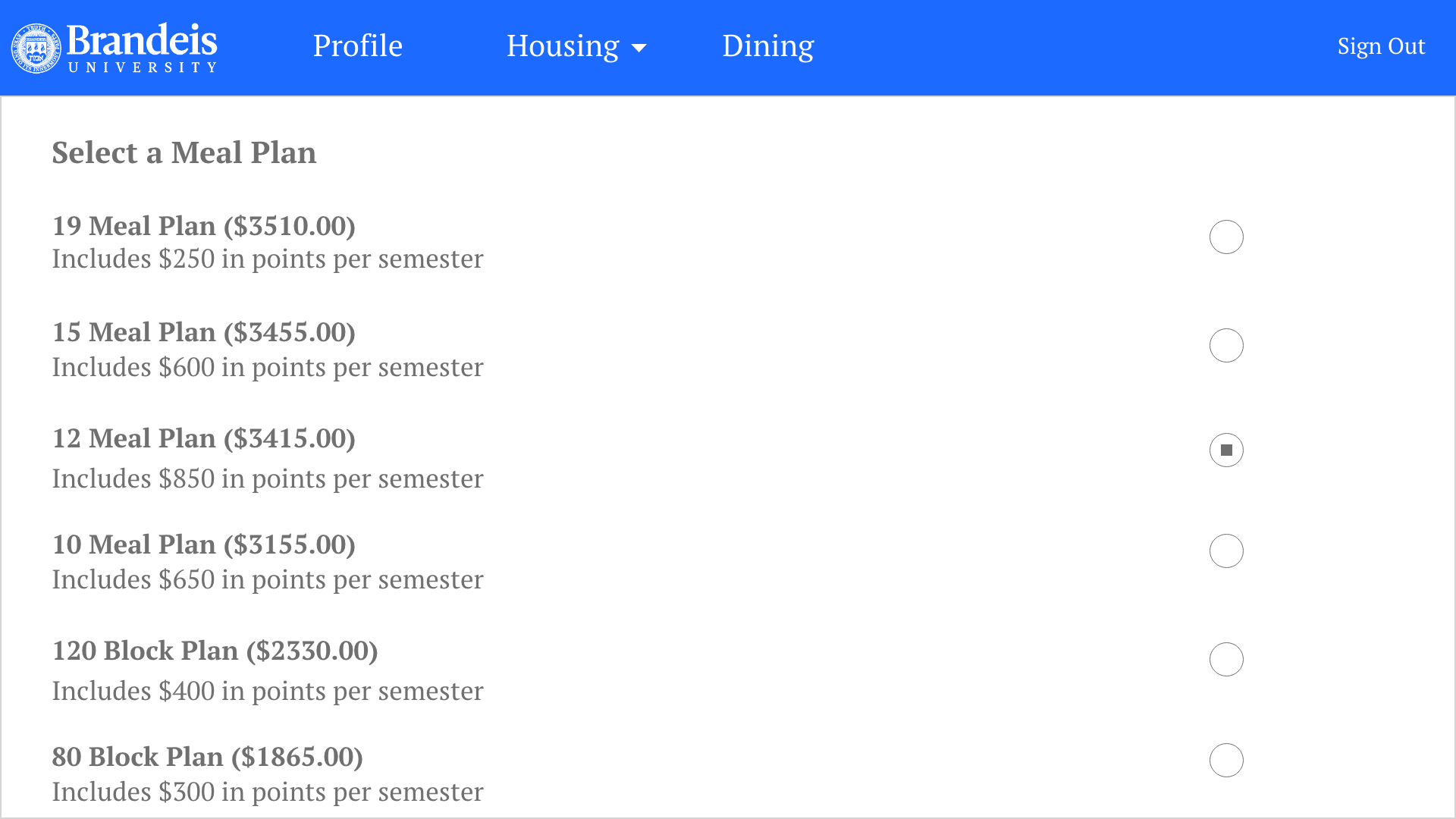
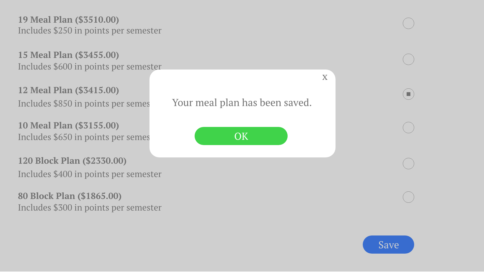
Selecting a meal plan. When it is time for Sam to select a
meal plan, all he has to do is click on "Dining," choose a meal plan, and save. In the current MyHousing,
selection is similar except there is no information on what each meal plan offers. Sam would have to find
it on a page in the Brandeis website. Moving the information to MyHousing is much more convenient.
Feedback & Reflection
Three teaching assistants evaluated our redesign. They felt the redesign was much more
intuitive and had higher utility, but could be clearer in a couple of aspects. They felt an explanation on what the
selection number meant would be helpful, and that the floor plans may not have enough information for underclassmen who
are not familiar with the different dorms. Overall, it was good but could be even better.
This project was the first time I was able to conduct usability testing. I was aware before about the importance of
testing, but now I can say I truly understand why it's needed. The paper prototype helped me see how users were responding
to my design, so I knew what to keep and what to change. The evaluation from the teaching assistants also reminded me
that any design has room for improvement. If I were to redo the assignment, I would incorporate their
feedback and expand some of the features more.